Figma prototype at the bottom of the page
CREATIVE BRIEF FOR RECIPEBOX // process
YOU CAN CLICK THE FIRST IMAGE AND USE ARROW KEYS TO SCROLL THROUGH THE IMAGES
USER FLOW // PROCESS
This is a simplified user flow highlighting FIVE of the main TASKS
that a new user will get to accomplish once they get on the app.
that a new user will get to accomplish once they get on the app.
1. Sign Up/Sign In
2. Creating a recipe (edit + save included)
3. Adding ingredients to shopping list
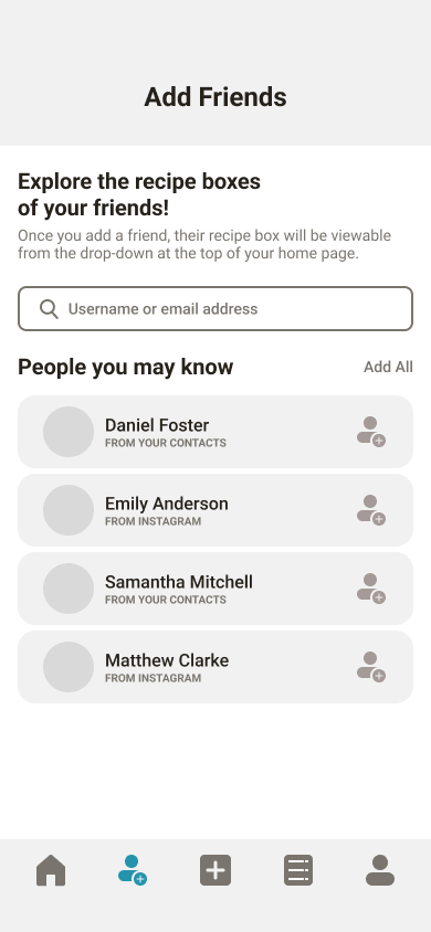
4. Find friends you may know
5. Switch between recipe boxes (Your box -> Friend's box)
WIREFRAMES // Process
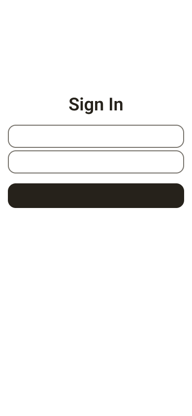
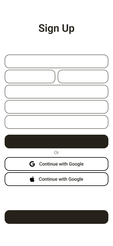
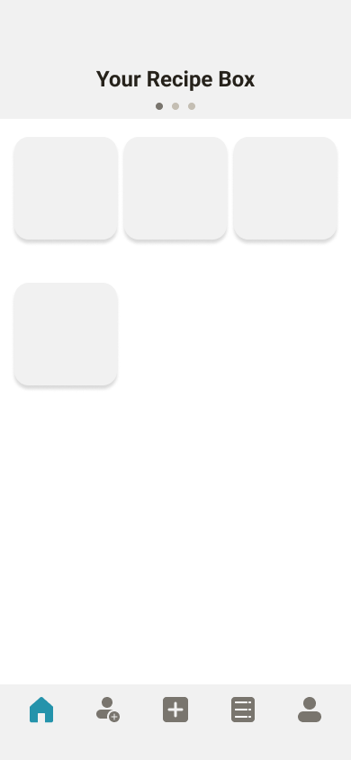
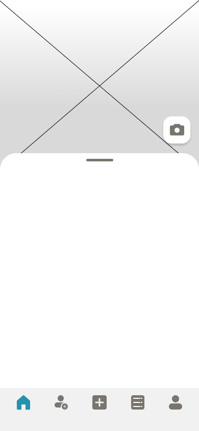
As rendered as these wireframes are, my goal was to keep the layout simple and clean. I felt that if I tried to come up
with a unique layout that users won't be familiar with, it would have gone against the goal of the brand.
with a unique layout that users won't be familiar with, it would have gone against the goal of the brand.
I first did sketches on paper but most of my work was hands on and directly in Figma, as I had a clear vision in my mind.

USER TESTING // PROCESS
Testing was done through USERTESTING.COM.
The major user frictions were as follow:
- Unclear call-to-action to switch between recipe boxes
- Profile icon and Friends icons were too similar
- Wishing to share/copy other user recipes and also auto-add items to ingredient list
[LEFT] BEFORE FEEDBACK // [RIGHT] AFTER FEEDBACK
FIGMA PROTOTYPE
CLICK EXPAND TO HAVE A BETTER EXPERIENCE!
IF THIS PREVIEW DOESN'T WORK
CLICK HERE FOR THE PROTOTYPE LINK
CLICK HERE FOR THE PROTOTYPE LINK
